


Diao Yu Tai-Premier Liquor
Project: Diao Yu Tai-Premier Liquor
Brand: Diao Yu Tai
Service: Design
Category: Liquor
Before designing this exclusive edition, BXL Creative designers first analyzed the Diaoyutai products on the market and found that most of its product packaging are simple. The colors were red, yellow, and blue. This also leads to the lack of unique visual symbols in products, and no memory points and unique characteristics, causing consumer aesthetic fatigue. Based on the above analysis, BXL Creative designers made the creative design of the outer packaging for the Diaoyutai Premier White Wine, the main purpose was to differentiate, highlight the product personality, and let people fall in love with it at first sight!
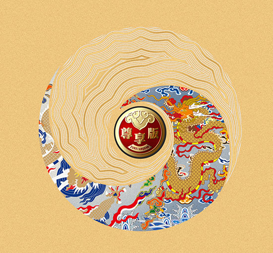
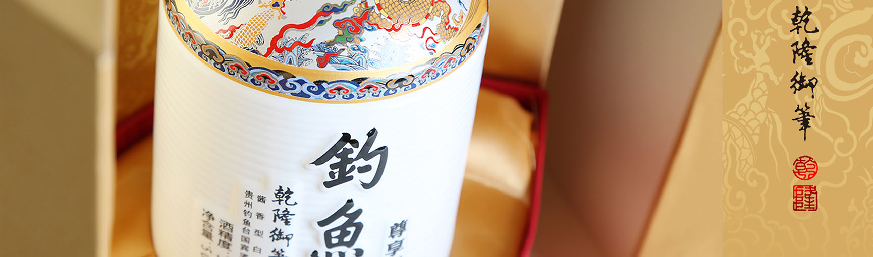
BXL Creative designers starts with refining visual symbols: the rise of the national, showing the style of a big country, and highly appreciating peace. We use royal cultural elements as the product cultural endorsement, through the graphical refinement of visual symbols, and use "Harmony" as the central advocated theme for creativity. "Harmony" is closely related to the wine-making process of sauce and wine, embodying harmony in value and harmony between Yin and Yang. The graphics of jade dragon and calligraphy are complementing each other. Through graphics, consumers can remember the symbol of the product in a short time.
Interpretation of Bottle and Outer Packaging Design:
As we all know, Maotai Town, Renhuai City, Guizhou Province, has excellent water sources, along with perfect geological and climatic conditions for wine-making. It has accumulated superb brewing technology and rich brewing experience over thousands of years and brewed a type of Sauce-flavor baijiu with a rich and unique microbial community, well-known since ancient times.
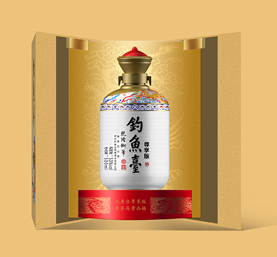
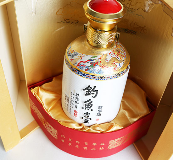
In 1999, the Diaoyutai State Guest Liquor Factory settled on the Chishui River, and Diaoyutai Liquor had a foundation for development and growth. Therefore, the package opens with a door to welcome visitors from all directions, representing Chinese hospitality.
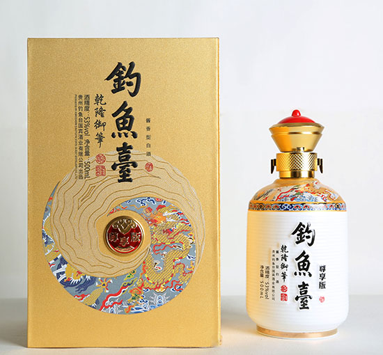
The Outer Box:
The outer box uses beige as the primary color, reflecting the auspiciousness and beauty of the exclusive version and highlights the quality.
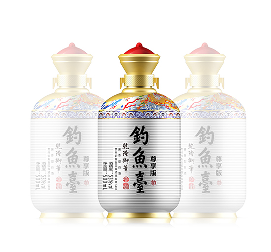
The Bottle Body:
The liquor bottle adopts the elements and symbols collocation surrounded by a streamlined design, present coordination and brilliant atmosphere.
Bottle Top:
The top of the bottle cap assumes the shape of a crown, which means the sky is round and makes the product more traditional and cultural.
Bottle Body:
The bottle is decorated with auspicious elements such as a flying dragon and auspicious clouds, which contain auspicious meaning.
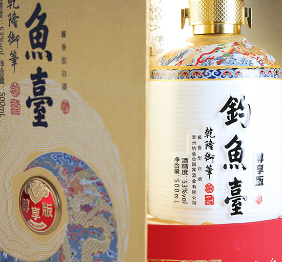
Craftsmanship:
The name is piled with black gold, the exclusive font is affixed with a metal plate, and the hot stamping effect on the surface of the font, so that the added value of the product is multiplied.
Send your message to us:
-

Phone
-

E-mail
-

Whatsapp